
Summary
Shopping Center Augusts needed a simple digital way to show store locations.
2410 built an interactive, responsive map with editable labels and links.
Users can easily explore the mall on any device, and updates are managed via admin panel.
Client story
Shopping Center Augusts wanted a simple yet modern solution to display store locations on their website. They didn’t need fancy animations or complex 3D features - just something clean and practical.
They envisioned an easy-to-navigate store map, like in other large malls, with visible shop names that could be edited later without rebuilding the layout. With 2410’s guidance, the final map offered just that: a clean floor plan, clear labels, and dynamic links - easy to maintain, mobile-friendly, and visually aligned with their brand.
Project overview
2410 developed an interactive map for Shopping Center Augusts, designed to present all store locations in a clear single-floor layout. The project was implemented using Editor X, ensuring the map remained responsive and intuitive across desktop and mobile platforms.
The map features permanently visible store names and hover effects that highlight individual locations. Clicking on a store redirects users to the respective store’s detail page. Store names and their font sizes are managed through a dedicated admin panel, enabling easy real-time updates without developer assistance.
To keep the user interface uncluttered, tooltip popups were intentionally excluded. Instead, the focus was on simplicity and clarity - users see all the essential information at a glance.
The solution was iteratively developed and tested with ongoing client feedback. Despite exploring a potential gift card section via Octobercms, the decision was made to pause that phase due to backend limitations and budget constraints.
The final outcome was a fully functional, SEO-optimized store map that enhanced user navigation and contributed to a smoother digital shopping experience.
- Shopping center "Augusts"
Key features delivered
- Interactive 1D store map with 17 labeled stores
- Hover effects for visual feedback
- Responsive font sizing within dynamic store blocks
- Dynamic content via admin database (store names, font size adjustments)
- Multi-device support (desktop, tablet, mobile)
Technology stack
The result
The final result is a sleek, fully responsive interactive store map for Shopping Center Augusts, seamlessly integrated into the client's website. Designed with a mobile-first approach, the solution delivers a smooth, intuitive browsing experience across all devices.
Built on Editor X, the map allows users to easily navigate through 17 stores, with each location labeled clearly and linked to its individual store page. Store names and font sizes are pulled dynamically from a connected admin database, ensuring fast and effortless updates.
Tip: Admins can adjust font sizes directly in the CMS using a numerical value system, making it flexible for future layout changes.
With performance and simplicity in mind, hover effects were used instead of popups or tooltips. This minimalist design choice keeps the interface clean while still offering engaging visual feedback on interaction.
- Mobile and desktop optimized with proportional font resizing
- Admin-controlled updates via a Shops database
- Dynamic linking to each store’s page
- Responsive layout adapting to different screen sizes
The development process included several iterations and visual refinements based on real-time client feedback. This ensured both functionality and visual fidelity met the expectations for a premium shopping center website.
The final version is now live at: tcaugusts.lv/map
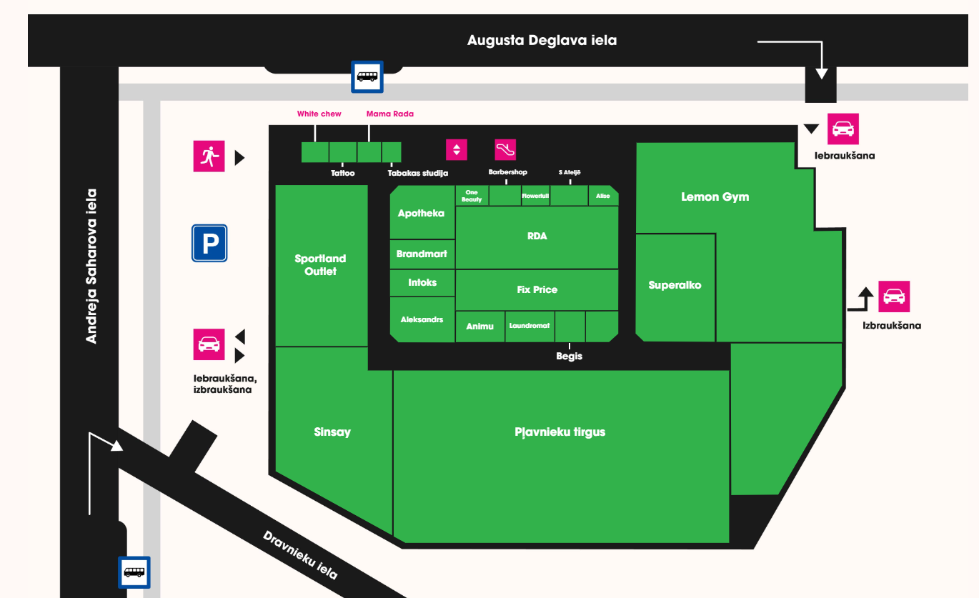
Final interactive floor map of Shopping Center Augusts displaying 17 stores with dynamic labeling
Final interactive floor map of Shopping Center Augusts with dynamic store labeling
Thinking about building a similar system?
Here are the most common questions we receive from clients interested in developing interactive maps or similar custom web modules for shopping centers, venues, or real estate platforms. These answers will give you a clearer understanding of what’s possible, what’s needed, and how the process works.
Yes, absolutely. The system we build includes an easy-to-use admin panel where you can update store names, links, and font sizes. No coding is required. All edits go live instantly, giving you full control over your content.
We typically use platforms like Editor X or Webflow for projects that require a visually rich frontend with manageable CMS features. However, we can also integrate with custom CMS or existing systems if needed. The platform choice depends on your flexibility needs and technical infrastructure.
Yes, responsiveness is a priority. All layouts adapt to various screen sizes with dynamic resizing of fonts and interactive elements, ensuring the map looks and functions perfectly across desktop, tablet, and mobile.
Definitely. We start with your floor plan or schematic, then translate it into a stylized digital version that aligns with your brand. You can define colors, fonts, hover effects, and even placement of text elements to match your aesthetic goals.
The system is designed with scalability in mind. You can easily assign a new store to a predefined area on the map, edit its name, or remove it completely via the admin panel. For major changes like adding new zones, we offer support and adjustment services.
Yes, multilingual support can be included from the start. Store names, categories, and navigation elements can all be localized based on user language preferences. We integrate language toggles as part of the frontend structure.
We begin with a discovery phase, where you provide your floor plan, design guidelines, and business needs. From there, we propose the best technical and visual solution, draft a development timeline, and move forward once everything is aligned.